Review by Rick Desjardins
Introduction
Lester B. Pearson Airport, ICAO: CYYZ is the largest and busiest airport in Canada and is located in Mississauga, Ontario approximately 22 km northwest of downtown Toronto. The airport is named in honour of Lester B. Pearson who was the 14th Prime Minister of Canada and recipient of the 1957 Nobel Peace Prize.
In 2019 the airport handled over 50 million passengers and is the second busiest international gateway airport in the Americas second only to New York’s JFK airport. It serves as the primary hub for Air Canada and also serves as a hub for Westjet and Fedex Express. The airport has 5 active runways and for the past 9 years more than 75 airlines have operated about 1,250 daily flights to over 1780 destinations.
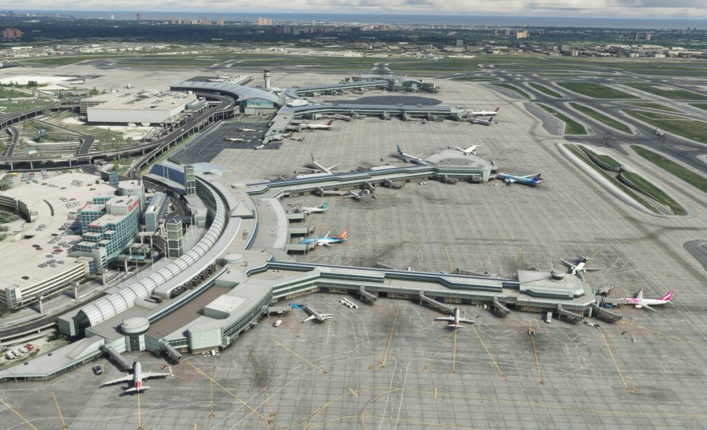
The airport has two active passenger terminals with both accommodating domestic, trans-border and international flights. There is a third public terminal known as the Infield Concourse or IFC which is an extension of Terminal 3. There was a Terminal 2 however it was closed and demolished in 2007 with the expansion to Terminal 3. The numbering was not changed to avoid any confusion. Along with the passenger facilities there are three main cargo facilities; Cargo West (Infield), Cargo East (VISTA), and Cargo North (FedEx).
I have had the opportunity to fly in and out of Pearson numerous times over the past decade so I was looking forward to seeing how Flytampa imagined Pearson airport.
After purchasing the product you will receive a serial number and then will be required to download the Flytampa_Universal_MSFS_Setup.exe program which you will then run to access the actual scenery download and install the product. When the installation has been completed you will be presented with a screen displaying the version number of this scenery along with the changelog, for this review that was v1.1. The scenery is automatically placed in the MSFS Community folder in a Flytampa-toronto folder. I was a bit disappointed that there was no documentation or configuration tool as was provided with the FSX or P3D versions. As far as documentation goes on their product page there is a link to a series of outdated PDF charts.
On to the scenery; bringing up CYYZ in the world map the first thing you’ll notice is that two of the airport’s five runways are missing from the map; 6R/24L and 15R/33L. This anomaly has been brought up in the product support forums by a number of people; Flytampa gave some limited responses but no resolution has been forthcoming. I will say that beyond the fact that I could not select either of these runways as my departure or destination location via the MSFS map menu these two runways were fully functional otherwise. In any of my flights that originated from CYYZ I simply started from a designated parking spot. This may prove to be a concern to some users so be aware if you fall into that category.
Anyone familiar with this group’s work will no doubt be expecting a top notch product, I know I was. Did they pull it off? I have to say yes. It is definitely made to the high standards we have come to expect from Flytampa. This group has a reputation for creating realistic looking airports and this is no exception. They checked off all the boxes with this product. From the ground up I felt the overall quality was outstanding.
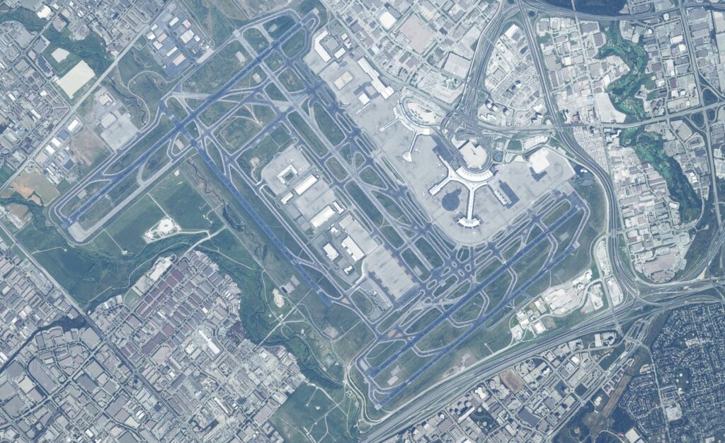
This is an overhead view the scenery coverage area.
Ground Textures
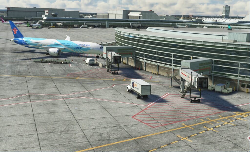
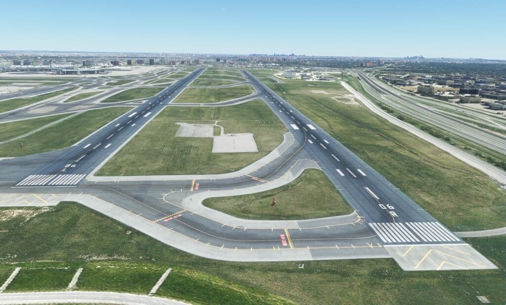
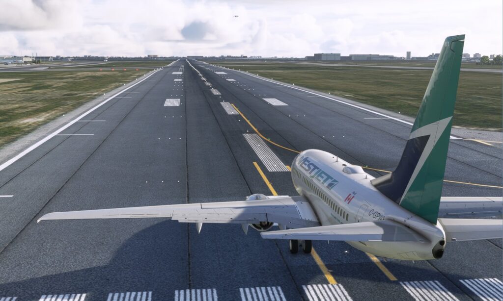
Let me begin with the ground textures, the foundation of any scenery. High resolution textures were used throughout and all looked very realistic. Enhancing these same textures you see tire marks on the runway landing zones, dirt and grime in parking areas and along the most used taxiways. Additionally the ground markings were crisp and clear, a definite highlight in my books. This attention to detail carried through to the remainder of the ground textures used for the entire scenery area although there were a very few exceptions. There were some areas between the terminals and adjacent hotels where the ground textures were visually inferior. I however consider this to be minor and only an issue if you happened to be exploring this part of the airport at or near ground level as I never noticed this while flying around.
Structures
Structures obviously play a large part in the scenery and they have been meticulously recreated again using a variety of high resolution textures. Differences in building materials, aging, weathering, dirt and grime, all of these facets of realism are employed to ensure the high level of visual realism you will experience. The structures are also 3d, which is to say that many of the features in these structures are made up of actual discrete separate objects. We see this in many instances for entrances and hangar doors.
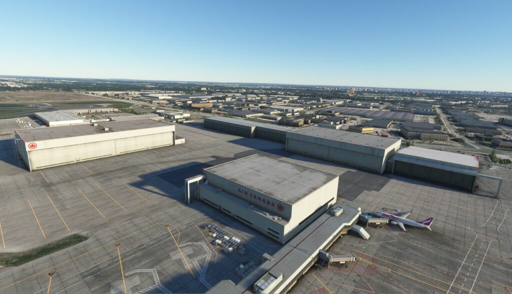
At CYYZ the majority of the large structures are basically located in 2 main areas. The first is between runways 6L/24R and 15L/33R. This is where we find passenger terminals 1 and 3 and the Air Canada Hangar campus.
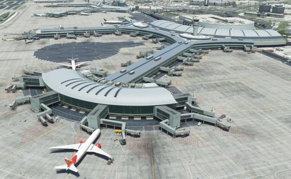
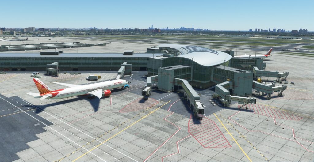
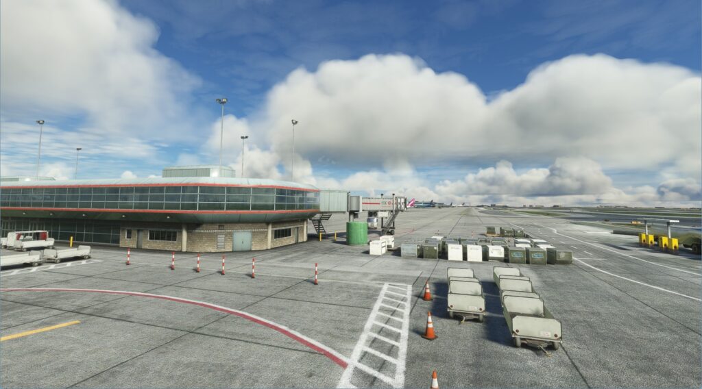
Terminal 1 in my opinion is the most interesting structure with its double hammerhead design. The building’s distinct shape is beautifully captured. All of the glass surfaces of which the majority are transparent are nicely reproduced. They’ve done a great job with the convex roof; here we see the metal and glass that reflects the apron control tower which is also part of the structure. Numerous roof fans are clearly seen with some having rotating blades. Terminal 3 the other main passenger terminal also has its own complex characteristics with a roof line that sports multiple levels, a convex roof over the curved portion of the building and even a pyramid like structure in the centre area. Many of its walls contain large areas of transparent glass giving us a view into this terminal’s interior as well. Of course the jetways are all very detailed and movable, also of note on the apron side of the terminals along the ground level there are numerous service entrances and exits that have been modelled. One thing I did find lacking, when I arrived at a gate there was no visual assist docking system.
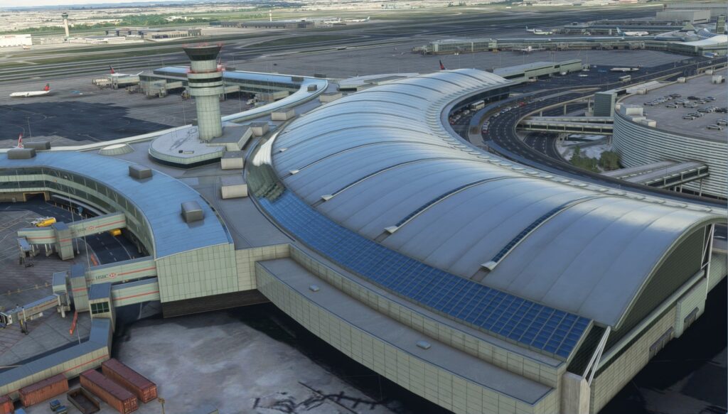
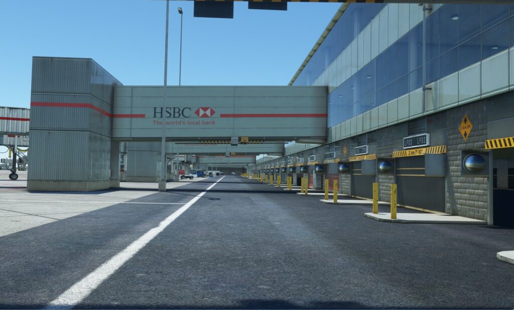
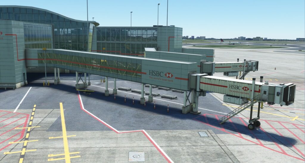

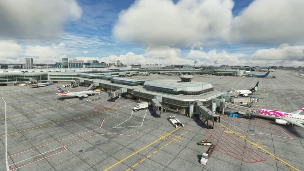
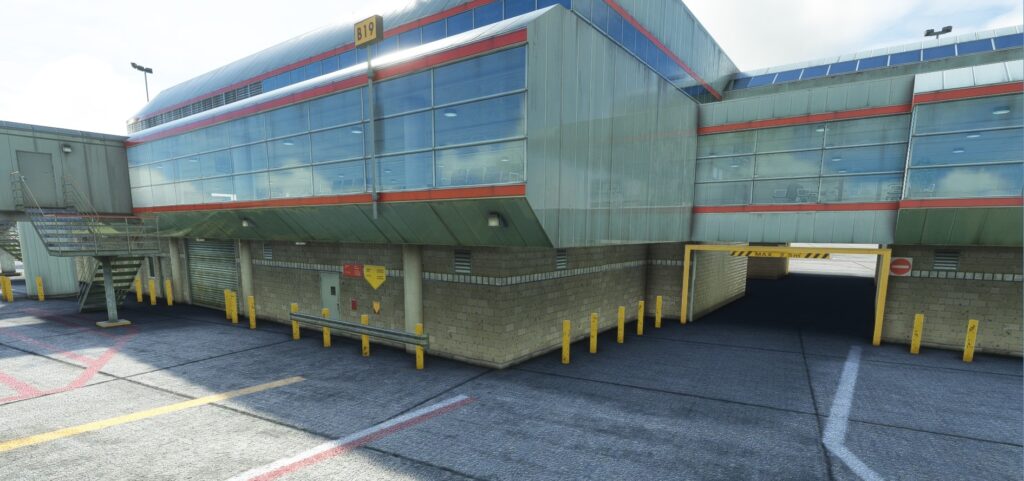
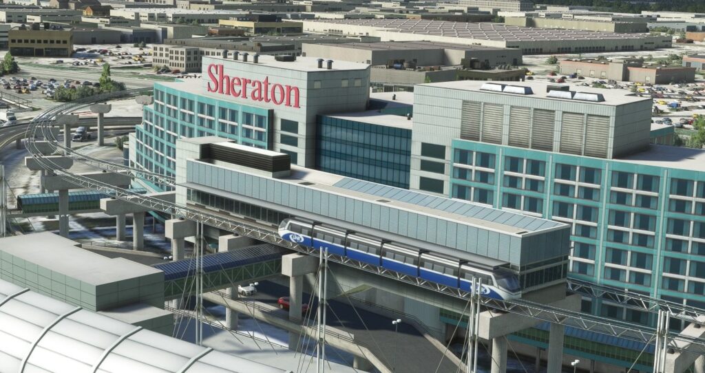
I think mention needs to be made about the work they put into the arrival side of these passenger terminals. Here we have the Sheraton and Alt Hotels, Viscount Rail station and the multi-level car parks. This is what you will see when arriving by car, public transport or the above ground shuttle train. Sure these may not be noticeable from the tarmac or factor into your flying however they are an integral part of the airport’s landscape and overall appeal. They haven’t been overlooked and were given the same level of attention as the other buildings at the airport.
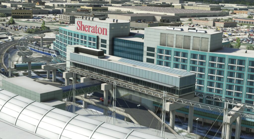
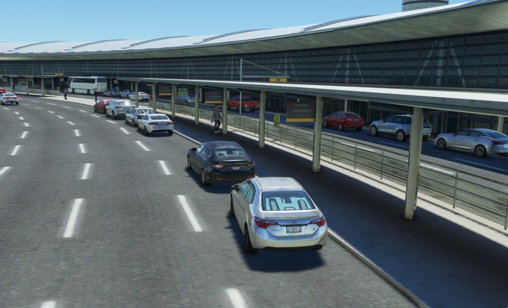
We flew out of Pearson last September parking our car in these very same garages and then flew out of Terminal 3. I have to say that while I explored this area at ground level it gave me the sense of being there all over again with the street signage, vehicles parked along the road and people milling about.
The Air Canada Hangar campus located just northwest of terminal 3 consists of a group of large hangars used by Air Canada for the maintenance of their fleet of aircraft. Here the same techniques are employed and the quality of their work comes through with great results.
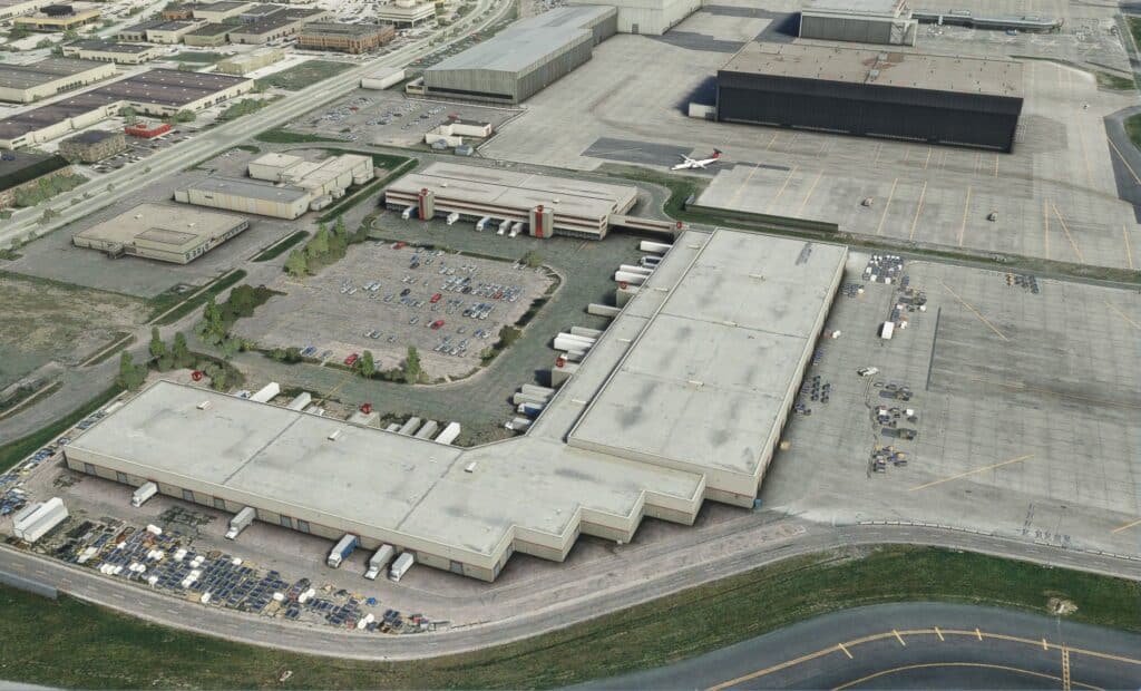
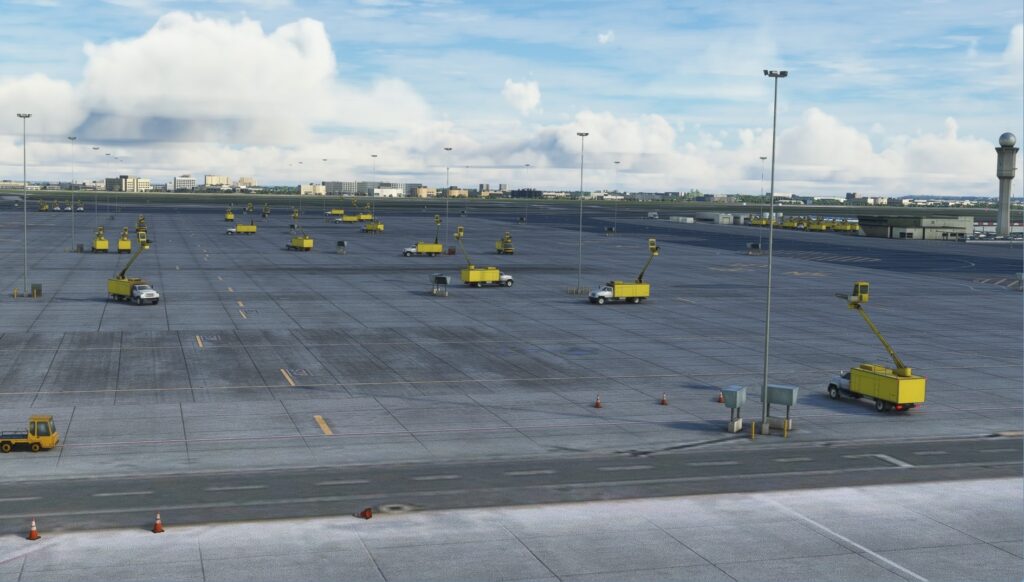
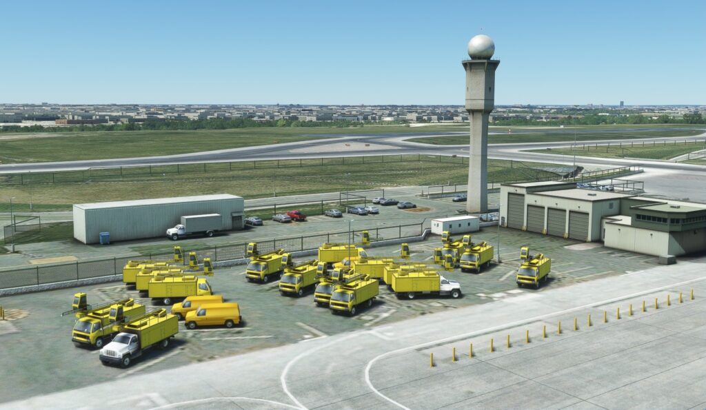
The other main area where we find large structures is between runways 15L/33R and 15R/33L, here you have the Infield concourse, Air Canada cargo, Westjet hangar, main control tower and the airport de-icing facilities. As was expected all of these were beautifully recreated to make us feel as if we were at CYYZ.
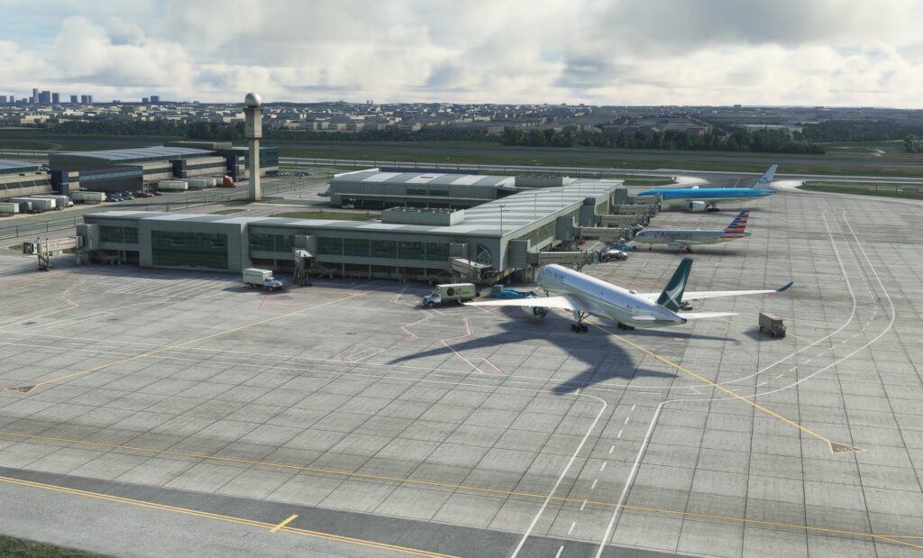
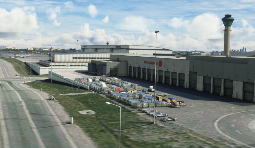

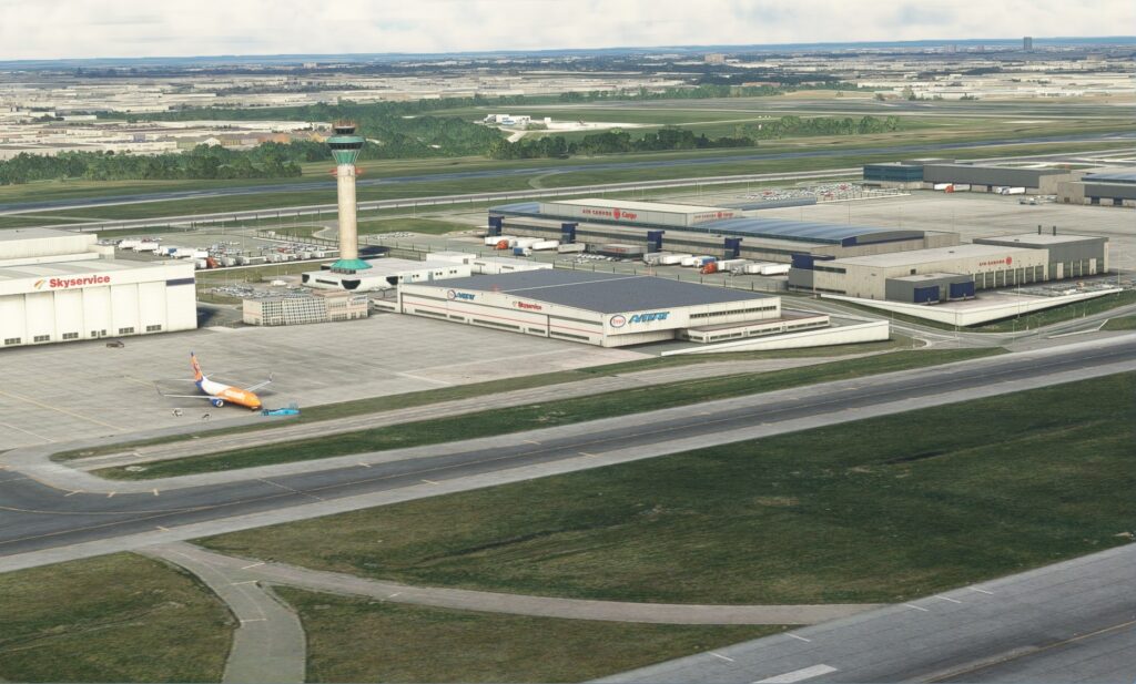
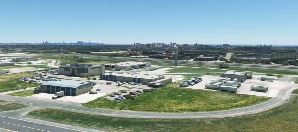
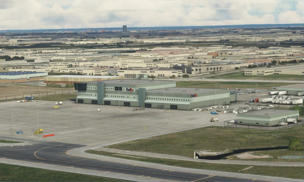
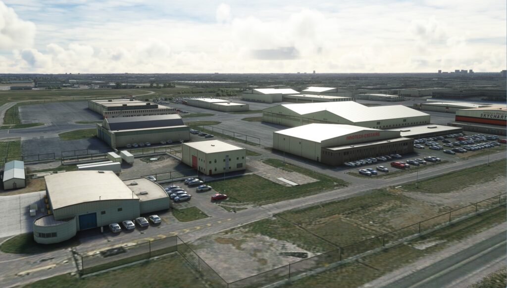
Scattered in other parts of the airport are other small clusters of buildings which include the FedEx cargo facilities, the GTAA offices and general aviation hangars. Not to sound like a broken record but here again you see their dedication to creating a quality product giving us convincingly realistic structures.
Objects
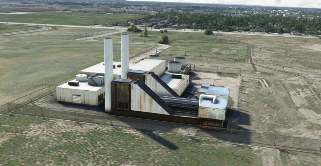
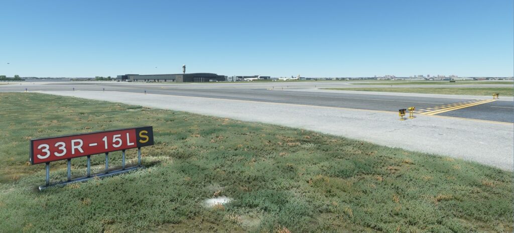
To bring a greater sense of immersion to the overall product and further augment the sense of realism they’ve included a wide variety of objects typically found at an airport of this size. Some of the more important ones as far as flight operations go are the various taxiway/runway markers, ground lighting, antennae and PAPI lights. As well they had all of the other types of objects you’d expect to see throughout. Items such as; baggage carts and tugs, bollards posts, recycle bins, freight and cargo containers, a variety of airport vehicles, lights, fencing, de-icing vehicles, passenger vehicles, etc, etc. Whether I was sitting in the cockpit at the gate in the 737, flying overhead low and slow in the Cessna or looking out from inside the terminal at the tarmac all of these realistically placed objects gave me the feeling of actually being at this large busy airport. Very impressive!
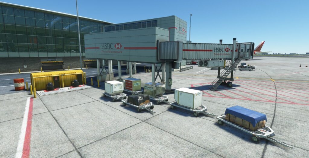
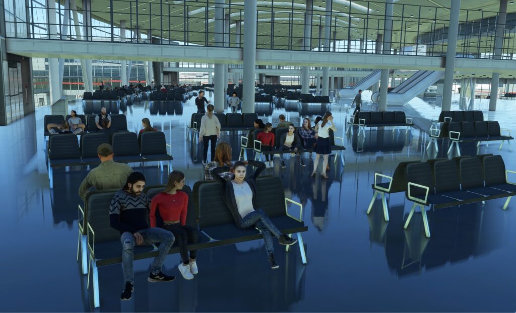
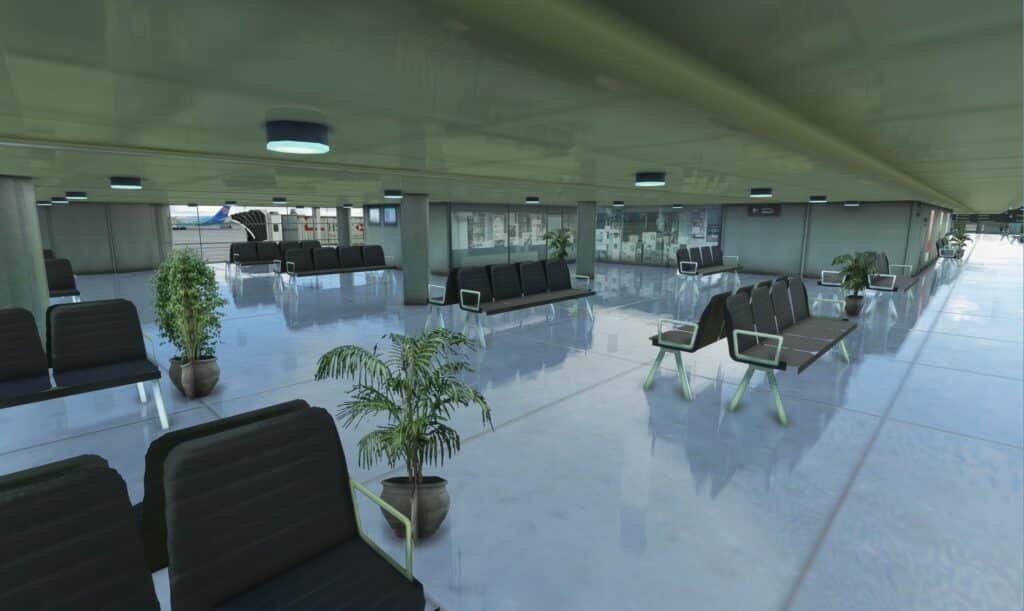
With MSFS came the adoption of modelling terminal interiors and with this airport they have continued that trend. Large portions of the interiors of both terminals have been included. Seats, flowers, check-in gates, escalators and transparent glass to name a few are all there. In addition, there are also passengers milling about, sitting on seats and talking on their cell phones. The occasional onlooker could be seen waving out the windows. I found this fascinating as I sat in the cockpit of my 737 at the gate looking in.
Animations
The airport is a vibrant and busy place so you expect to see the hustle and bustle at a large airport such as this. To that end they did include many commonly seen animations such as windsocks, jetways, and an assortment of airport vehicles travelling around the airport proper and on nearby roadways. As a service available to people hoping to get to the airport by the local public transport rail system or the clientele staying at the adjacent hotels there is an above ground train service that runs between the Viscount station and the airport terminals. This animated above ground train is a nice scenery feature that further amps up the immersion factor.
Night Time and Seasonal Textures
Flying into Pearson made for quite a sight with the discrete individual ground lights especially on approach. Tarmac and building lighting was also very good, not too overpowering. I think they struck a good balance to give us realistic lighting.
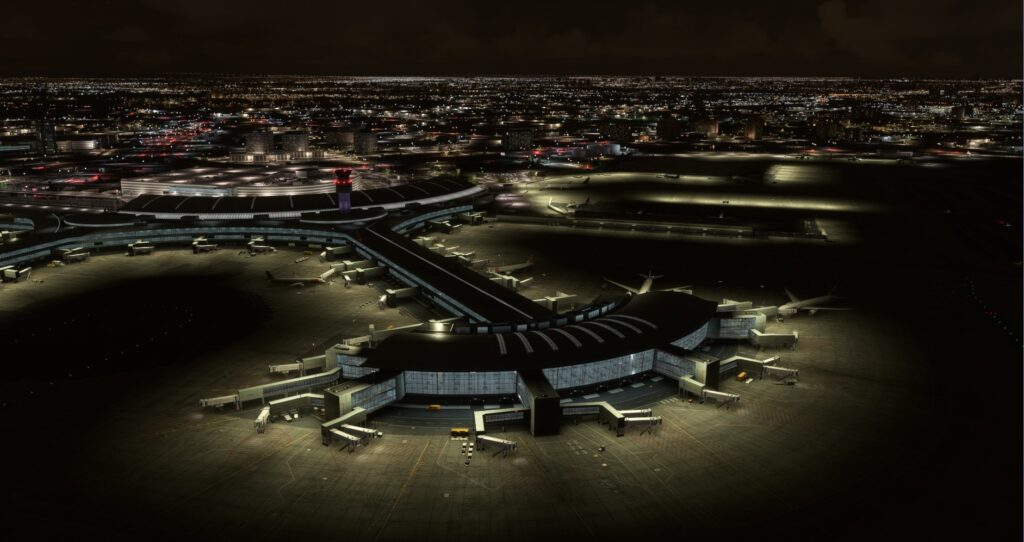
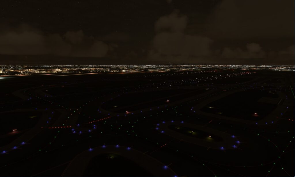
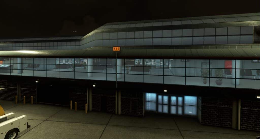
Toronto is prone to some snow in the winter months and I did manage to make a few flights with snow cover. Although good I did not see anything that stood out from the others to make me think wow.
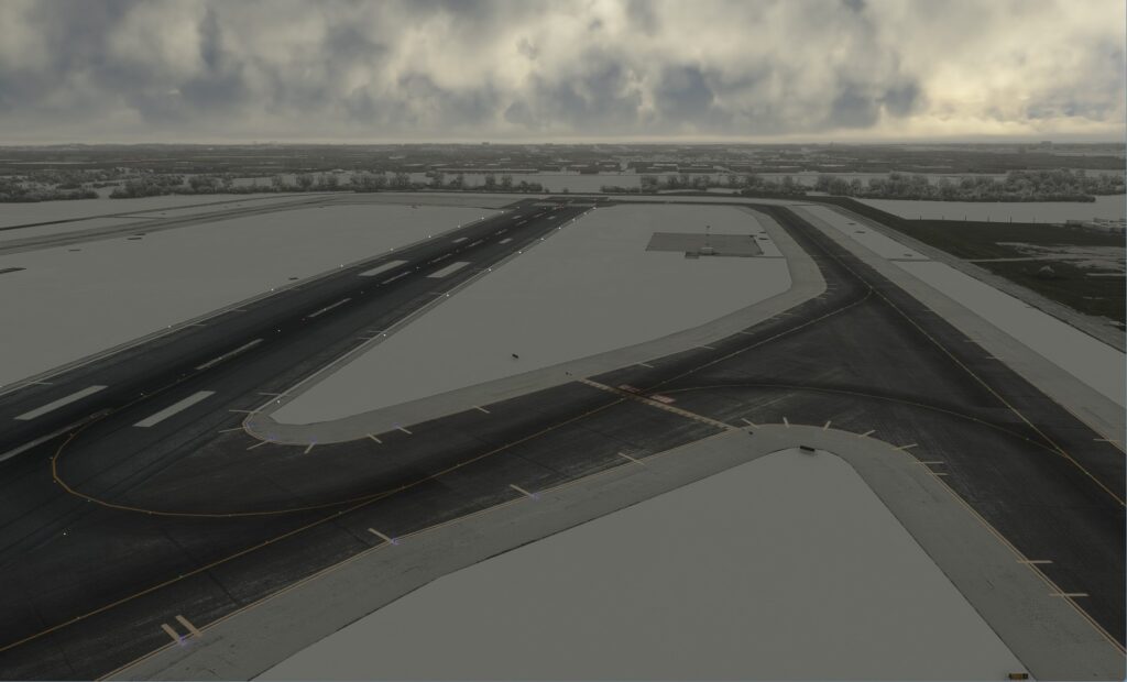
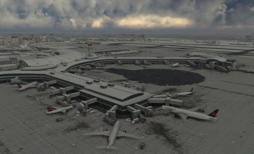
Performance
Always a concern with large airports is how it’s complexity will impact the performance of MSFS and therefore your overall enjoyment of the product.
To get an idea of how performance would be impacted I made a number of flights using both the MSFS default C172 and the PMDG 737-600, two ends of the spectrum as far as aircraft complexity is concerned. Let me first say that I have learned not to get hung up on the high frames rates that so many chase, but rather to focus on the smoothness and immersion of the entire experience.
To that end I figured that the C172 would not be too taxing or pose any real problems and I was right, everything was smooth with no stuttering at all. This was through a variety of landings, takeoffs and general sightseeing flights around the airport and surrounding metropolitan Toronto city area. But let’s be realistic, if you are going to purchase this product you are in all probability going to be flying commercial jets. So in my case that was the PMDG 737-600 a much more complex aircraft. Honestly I wasn’t quite sure what to expect. I just recently started flying in MSFS after many years of FSX so I was accustomed to the OOM problems, CTDs and the slide shows routinely encountered at many of the large payware airports. Flytampa Toronto for FSX being one of those that always gave me a problem.
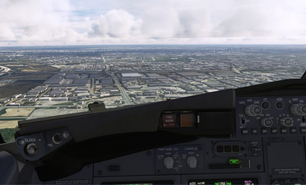
I am pleased to report that my many flights at CYYZ in the PMDG 737 were remarkably trouble free. The combination of this complex airport, the surrounding cityscape, the 737 and additional AI traffic posed no real issues. Once or twice nearing Pearson airport there were a few short duration stutters but that may have been a function of MSFS loading the scenery for the Toronto area as opposed to this addon causing the issue I cannot be 100% sure. Apart from those few isolated occurrences MSFS ran smoothly so I am very happy with the outcome I experienced.
Final Thoughts
I think that this airport would make a great addition to anyone’s stable of payware addons giving many hours of enjoyment as either a starting point or destination for any of your flights. It is well suited to handle large commercial jets or small private planes.
Review by Rick Desjardins
| Pros ➢ Very detailed textures and structures ➢ Highly Immersive ➢ Includes animated above ground train system ➢ Good performance ➢ Well priced | Cons ➢ MSFS map missing 2 runways ➢ No visual docking system ➢ No documentation or configuration tool |
| Purchase simMarket.com Developer: Flytampa Price: EUR 17.99 (+ VAT) | Test System Ryzen 5 5600X, ASUS TUF X570-Plus MB, 1 TB NVMe SSD, 32Gb DDR4 RAM, ASUS RTX 3060 OC w/12Gb VRAM, Win 11, Track IR, FSLTL AI traffic, MSFS graphics settings to Ultra. |

